DESIGN CHALLENGE
(circa July of 2016)
"Demonstrate how far you can get, from white board to visual design, in a short period of time. You will be judged on the content you create for yourself. There is no right or wrong design, just how you go about it in a short period of time while capturing the solution. Instead of box with text, round the edges and get some style in there. There are no real expectations, the team would like to see what a final screen looks like. Take as many short cuts as you can."
Screen shots of the whiteboard session were all I had to go on. No additional information was provided to me. No content. No feature sets. No mandatory actionable item's. No established flow. No data for basing the data visualization's on. Pie in the sky, open ended, subject-to-interpretation, blank slate. OK...here we go!!!
WHITEBOARD SESSION
The whiteboard session was intended for me to quickly distill several use-cases and sketch out the UI for a page layout. The information was verbally communicated in a one-on-one session within a small conference room that over-looked the beautiful San Mateo Bridge in California. The following is an over generalization of the information communicated to me in that session, to set the context for the challenge.
Whiteboard Challenge
Design a dashboard for the user to manage the company's portfolio.
Scenario
A coffee company is comprised of 100 plantations and 200 products, with multiple varieties, which are made up of 20 unique variable (variable undisclosed). The company also conducts trials for new product development.
User
VP of Global Operations.
Tasks
1) Manage operations based on; what's growing and where, cost of workers, yield, sales/cost, labor, maintenance, etc.
1) Manage operations based on; what's growing and where, cost of workers, yield, sales/cost, labor, maintenance, etc.
2) Generate financial reports.
HOUR 1 & 2
Stressing the Structure
As a point of reference for basing my decisions on, I established a general flow. It was pretty basic but went something like this.
successful sign in > overview of properties & products > identify low performing properties > select the lowest performing property > review financials > designate 1st quarter time range based on month and year > email; visual representation, supporting data, and suggested course of action to corporate team
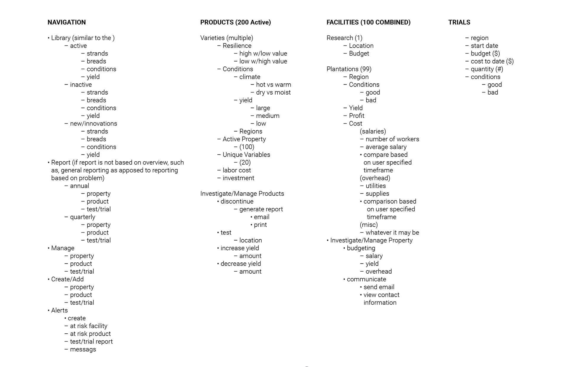
I know. Too basic, very high-level, but it was enough to keep me focused on the task-at-hand. I then recorded the whiteboard information and bucketed the content based on high level groupings of information.
In the document below, I am using dashes to record static content, indents to show the level various content is accessed, and bullets to record actionable items. I use this format since it is quick and easy to update on the fly. The information is distilled down to the simplest structure by reducing redundancies within each grouping.
HOUR 3
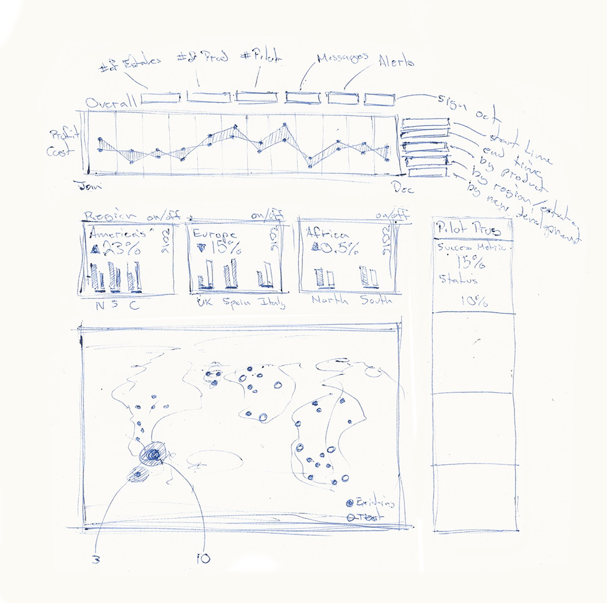
Oodles of Doodles
Once the content and IA had been loosely defined, I began sketching out ideas. Given that the primary objectives of the user is to Manage and Report, I placed financial information as the utmost importance, and used Time as the point of reference for all information displayed on the page. This way, all sub-categories for filtering data would remain in the context of Time.
HOUR 4
Building Blocks
From scratch, I began blocking in the page content. Starting with a black and white pallet while focusing on the high level bits then working through the visual hierarchy in grayscale. Starting with a black and white color pallet allows me to focus on layout, without being distracted by color balance, harmony, etc. Grayscale allows me to focus on the visual hierarchy by allocating varying levels of contrast and weight to primary, secondary, and tertiary elements.
HOUR 5 – 6
Reinforcing Relationships
At this point, I am looking at a page with no representational content. Meaning, there are no metrics, just placement text and copy that indicate purpose. It's also lacking color to reinforce the relationships of each element on the page, and style.
The metrics I chose are intended to communicate a perceived scenario and reinforce the flow. As the metrics changed, so did the page elements to support the story. The idea was to filter the page content based on Time, with actions pertaining to each grouping (Product, Trials, Facilities) to further filter the page content. I used Sales v.s. Cost since I thought profit margin's would drive management decisions based on Performance. I grouped Facilities by Region, which were further broken down in to sub-regions, and Trials were base on Level of Completion.
As content was updated, so was everything else. Icons are crucial in making the connection of elements with their purpose, so I simply used Font Awesome for the sake of time. Typically, I would generate a color pallet based on user research, brand identity, or an established style-guide, but since I had nothing to go off of, I used a pallet from a project I had worked on in the past.
The final page design was a dynamic dashboard which the user could filter prior to drilling in to execute on either of the primary tasks. The screen shot below is what was delivered.
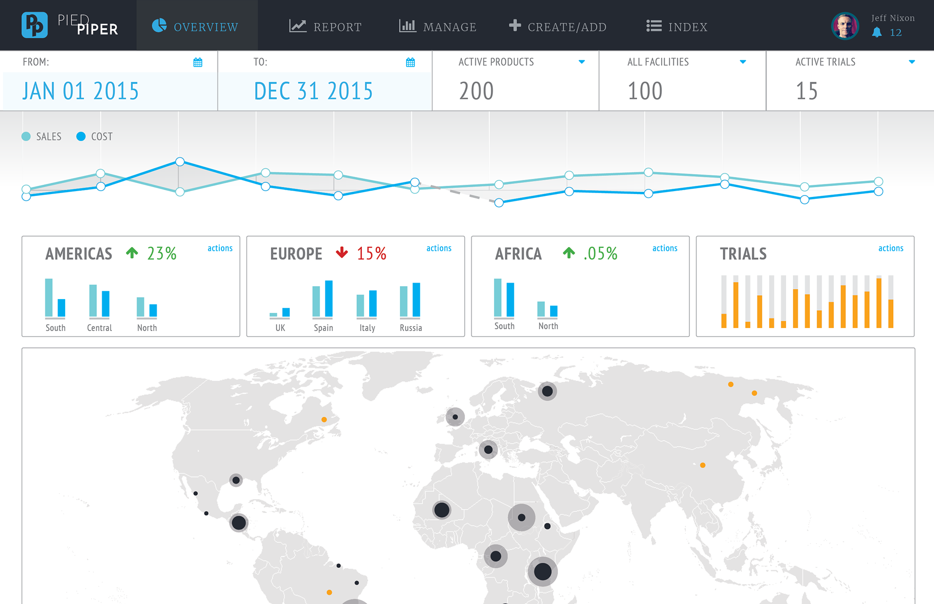
The end result is what I would consider to be more of a wireframe, or mockup. My focus was to showcase my ability for structuring content (IA), and how close to a final design I can get, within a set period of time. Although the process is not ideal, this challenge has helped me gauge my ability to go from concept to fruition, in no time flat. Since the design is at a point where content and structure are established, I wanted to challenge myself. I wanted to see how much more value can be added in another six hours...so I gave it a push.
HOURS 7 – 12
Time Presents Value
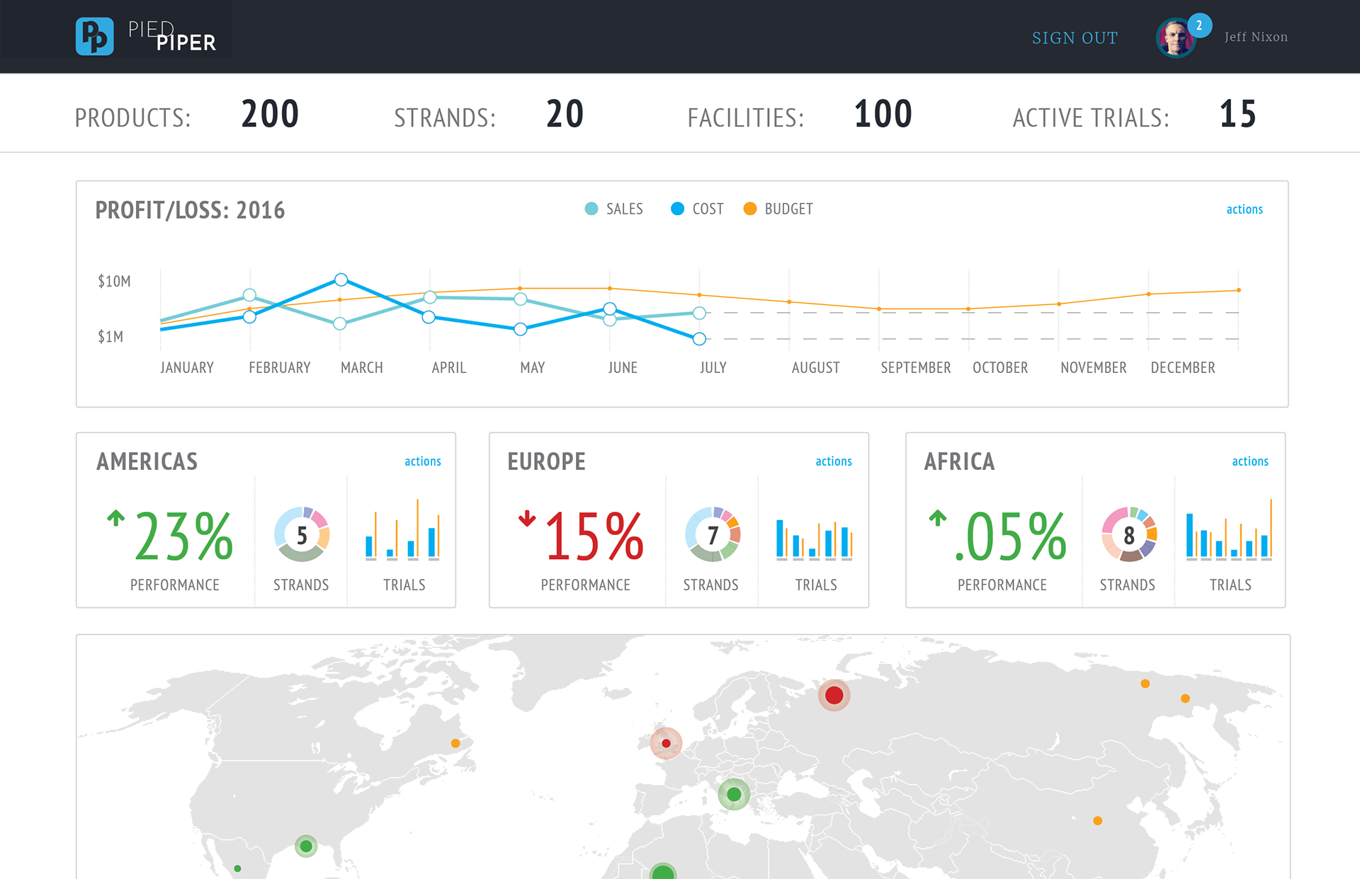
After fleshing out the original design, I felt the initial layout was too busy. I thought that there were a number of problems and things I simply didn't have the capacity to address. The metrics I used for Trials were a huge issue for me. The Map was incomplete, and the Navigation didn't seem necessary. I also found that Time as the only contextual marker for the page content, was limiting.
Originally I had intended the Navigation would allow the user to perform a task without drilling in from the dashboard. After giving it more thought, I imagined that the same filtering would occur on those pages, as what was available on the dashboard. My gut instinct was that this made for a convoluted experience, and detracted from the unique value of the dashboard.
One thing I thought worked well was the Performance metric within the Region tiles adding another level of insight to the user based on location. I ended up moving Product and Trials to the Region tiles, and exposing the unique variables as Strands. I felt this provided an added level of visibility to the breakdown analysis of the Financial Overview, and expanded on the context for the page content. Now the page reads from top to bottom, providing high-level information as a point of reference for the proceeding content.
Ideally, if I were given 12 hours to complete this project from beginning to end, I would have distributed more time to the initial phases, rather than backloading the design. I would have had a well developed flow, or two, in addition to compiling content based on a little industry research. I would typically have more information to build from, and there would be some existing format, style, content, wireframe, product, or something to set me up for a best foot forward. regardless of the scope being a little ambitious, I still enjoyed taking it on.
In the end, I turned down the opportunity. I won't go into details as to why, since I respect the people I interviewed with, as well as the company itself. They are growing, and have a great product. I simply didn't feel as though the environment was conducive to facilitating quality design, as of yet.
Feedback is Appreciated
Thank you for taking the time to read through this fairly lengthy portfolio piece. I try to keep them all short, in order to accommodate my audience, and present the bits I want them to see rather than the entire piece. Provided the nature of this challenge, and the importance of my thought-process to potential employers, I divulged much more information. Feedback is always appreciated. I can not only take a good slam, but go as far as to appreciate them, provided there is constructive feedback to back it. Information helps me grow. Helps me become a better designer. Improves my process and, inevitably, my outcome. So my question to you is:
What would you have done different and what is the outcome you would expect?
THANK YOU,

[Jeff Nixon]