DESIGN SYSTEM
This is a real-world project, the steps I took, rationale, and the outcome.
(circa 2016)
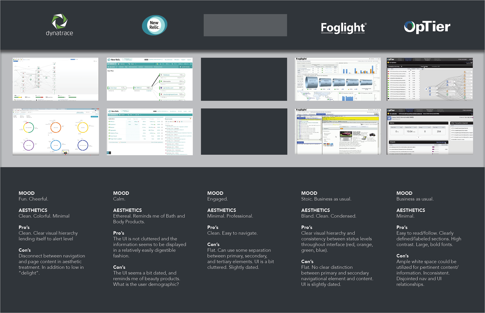
COMPETITIVE ANALYSIS
Side-by-side comparison of product and competitors, recording the mood each products UI evokes, in addition to the Pro's and Con's. This identifies opportunities for design as a solution for creating a gap between competitors.
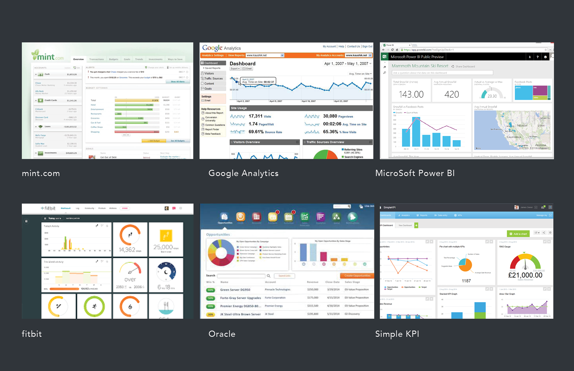
CURRENT TRENDS
Market analysis simply sets the criteria for leading by design within the set market place. To take it a step further, I looked into current trends within a more general category yet relative to the core functionality of the product. In this case, products providing operational and analytical dashboards...data visualization.
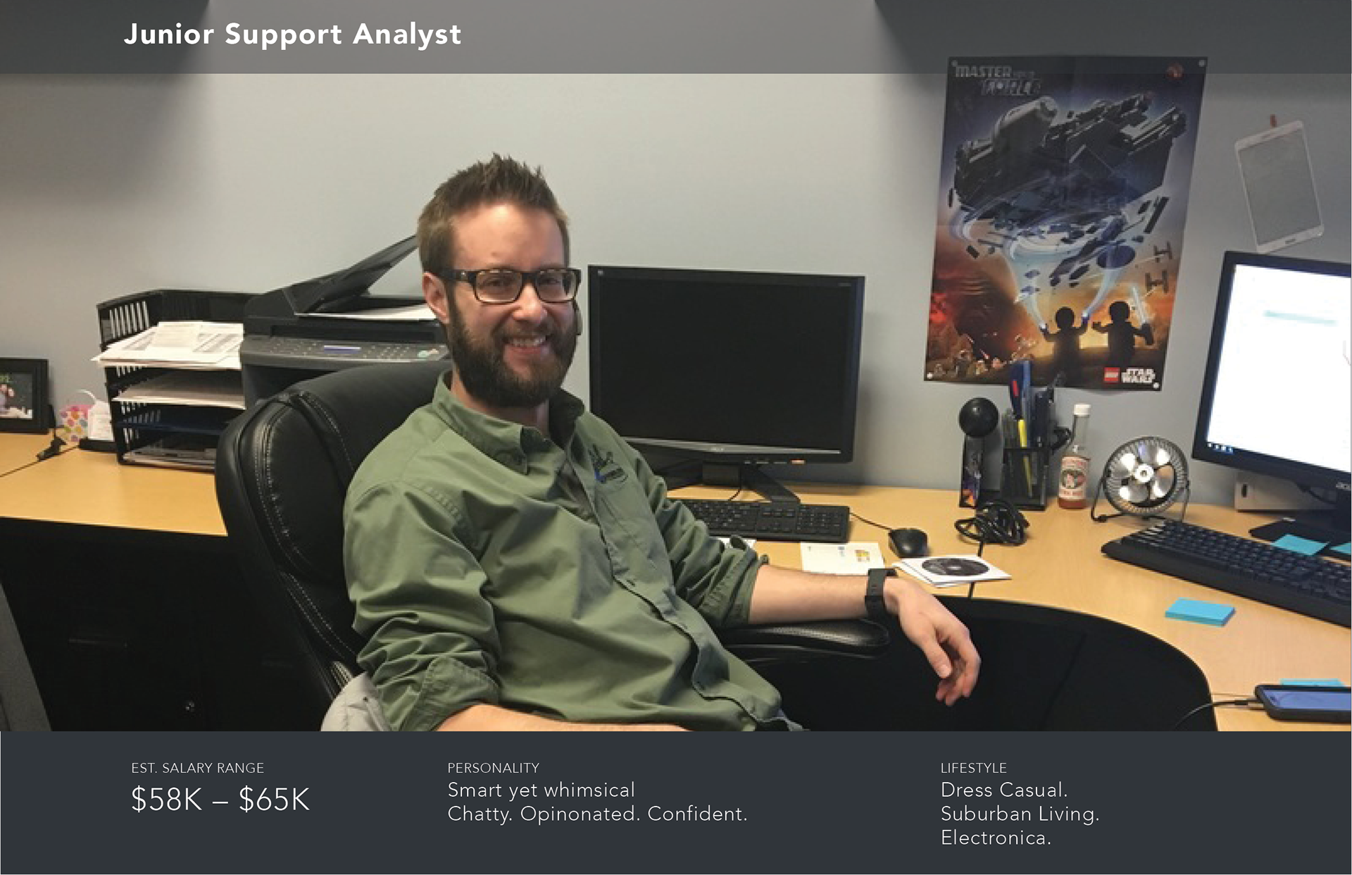
LIFESTYLE
Three perona's were provided as a jump off point for further research into a generalized perception of the end user's lifestyle. My research consisted of; establishing the pay range, back stories (press releases, blogs, etc) and un-earthed images of each user in their work envireonment. Note the Lego Star Wars poster on the wall as it will play into design concepts towards the end of this presentation.
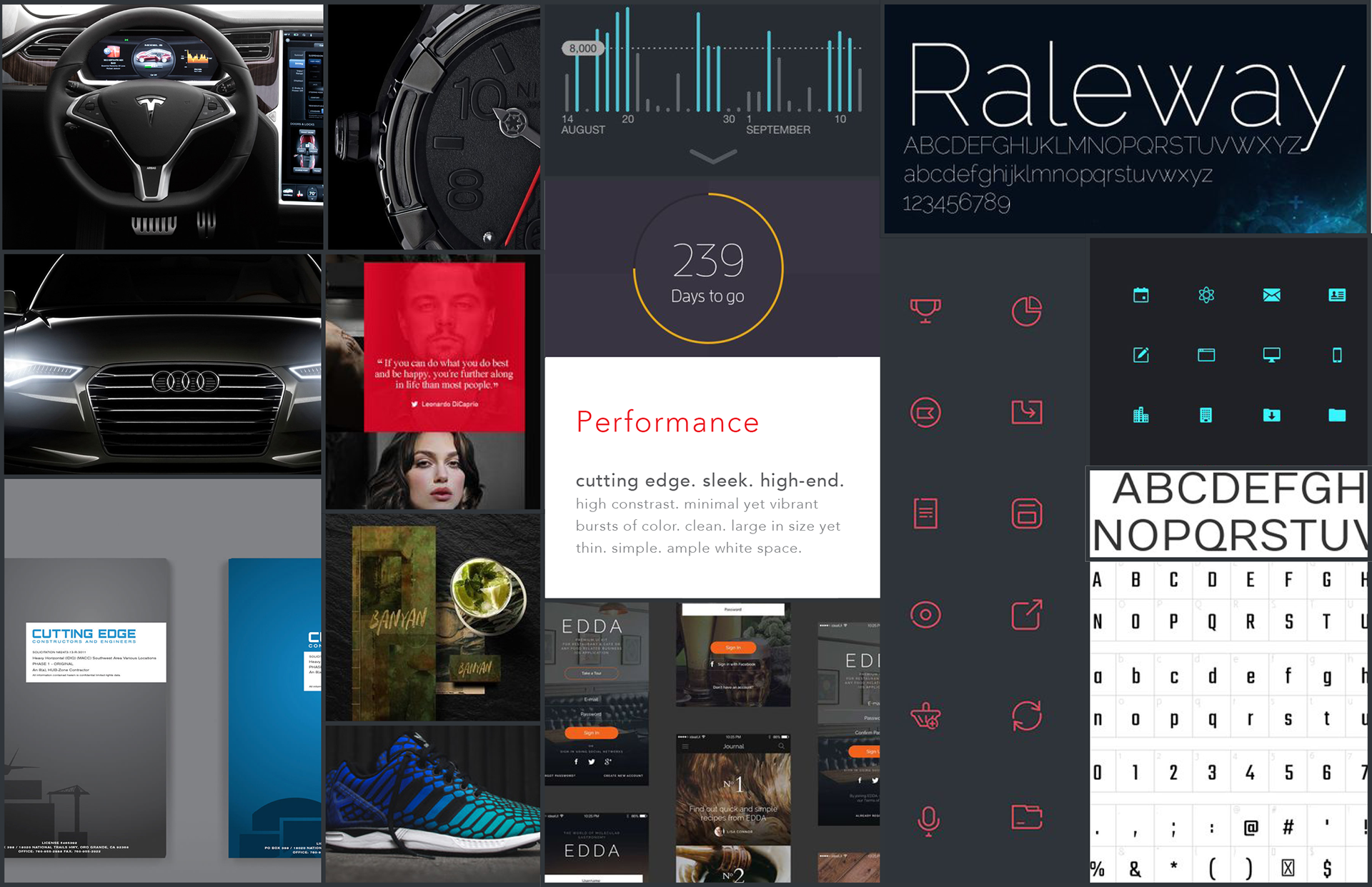
MOOD BOARDS
Each mood board was driven by key words intended to set the tone for imagery, UI design examples, fonts, and iconography that I felt would trigger an emotional response that align's with the user's personality..."delight".
STYLE GUIDE
With an established visual aide for basing the UI design aesthetic on, styles evolved from the mood boards, beginning to identify the foundation for a design system.
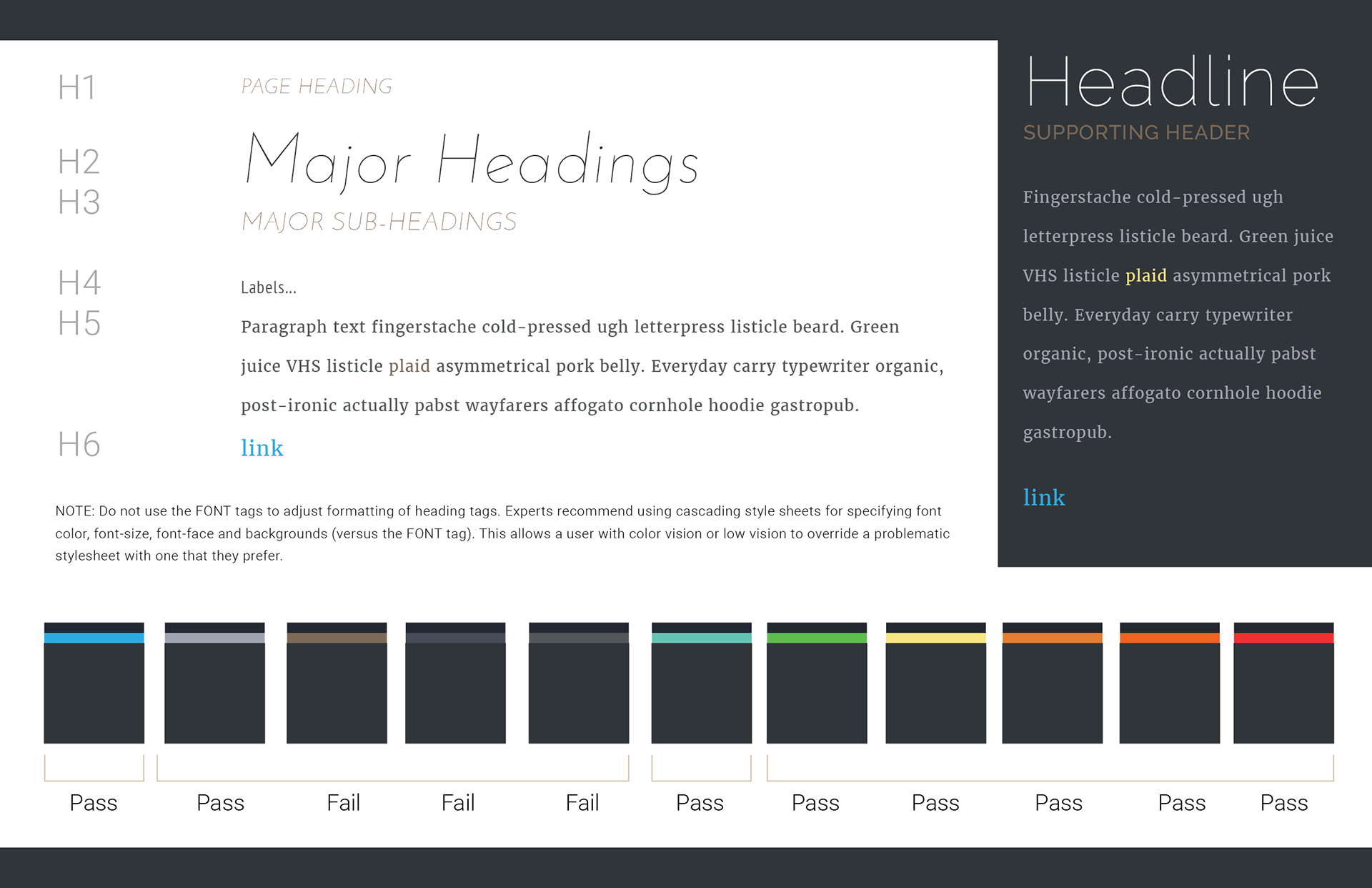
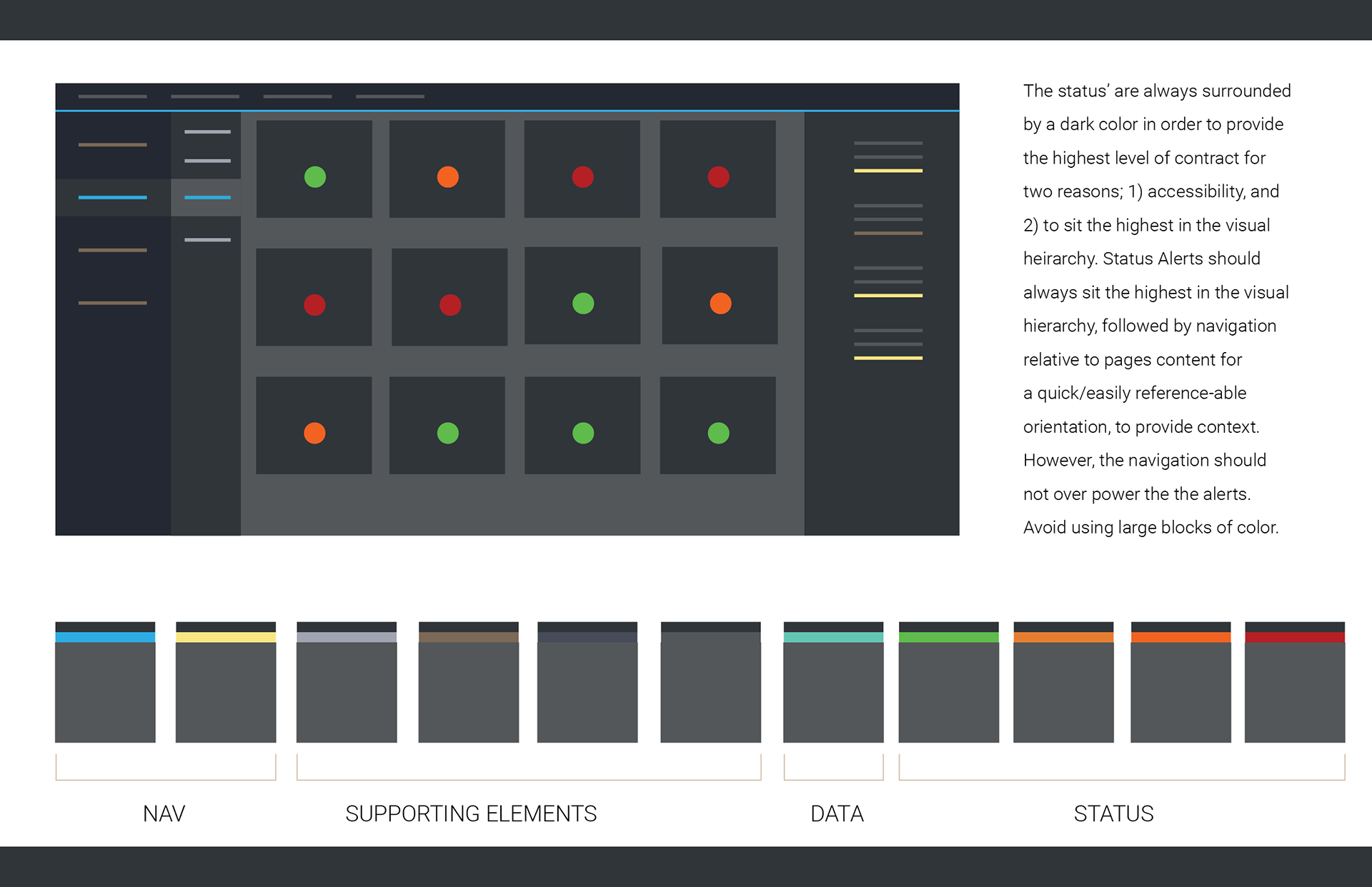
COLOR PLOTTING
I used a primary page layout from the product I was designing, and plotted color to establish a potential visual hierachy to test if the color builds, and general look-and-feel, would work.
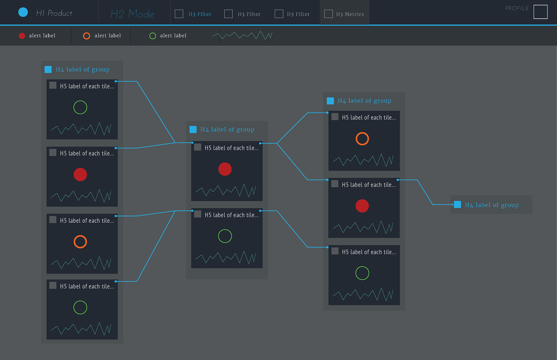
WIREFRAMES
I use wireframes for a handful of purposes, such as; capturing and structuring content on a given page as the basis of the IA, to demo concepts, and to communicate design intent prior to investing time going in a particular direction. Over time they evolve at a level of fidelity that represents an accurate portrayal of design intent and quickly iterate, based on feedback, without investing too much time. Here I am expanding on the intended use of header tags at a level of fidelity that is more tangible to achieve stakeholder sign off, without spending too much time going with a direction not conducive to the product roadmap. I'm using the following wireframe to sell the idea before moving forward.
CARD DESIGN CONCEPTS
Within a relationship map view, cards were used as the primary jump off point for a high level read before drilling in to investigate. I was tasked with solving for three things; a visual representation for 7 alert status', and accessibility. I used pie charts to illustrate the intensity of the alert status which solved for both problems in that the real-estate increases with the intensity to draw the users eye to the the more severe as a clearly established visual hierchy, which also addresses accessibility in that the severity is identifiable via size, in the absence of color. The exploration produced several concepts for addressing these problems, in addition to bucketing actions and relative content (scalability) as well as metaphorical imagery and customization (delight) that ties back to the competitive analysis as way to separate the product from competitors.
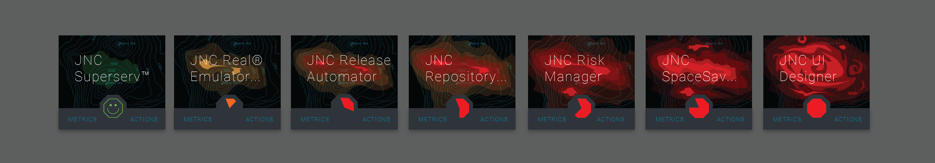
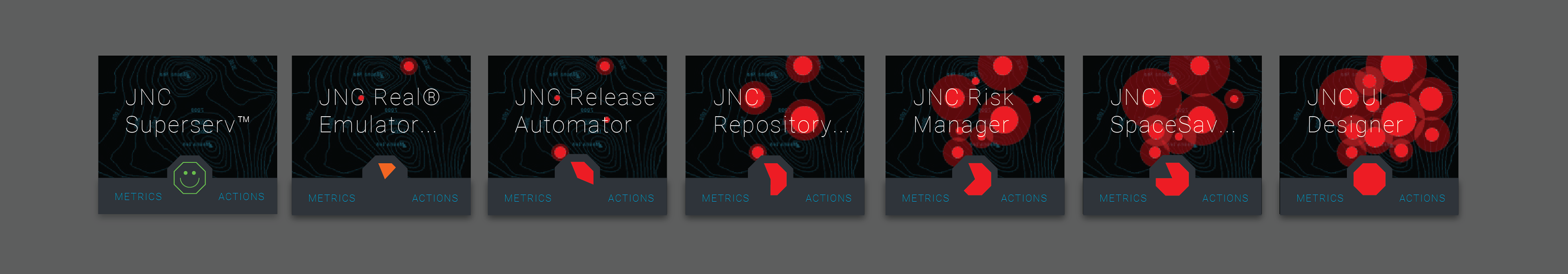
Concept 1: WEATHER THE STORM Heat maps show the increase in energy, or data, across a system. Whether that system is a city’s infrastructure, weather patterns, or an application, it provides the viewer with an instant read on a the intensity of a given data set. In addition to a “storm” being a metaphor for a severe condition, the image supports the pie chart, provides ample visual weight to clearly communicate the level of intensity, as well as addressing accessibility in that the heat map increases in size, and shape.
Concept 2: APOLCALYPTIC TRIAGE Cluster maps show the density of data within several area’s of interest. Like maps, applications have several moving parts, or “area’s” where things can go wrong...or right. I call this “apocalyptic triage” because the visual treatment reminds me of a virus spreading which ties in with the frequently used term “triage”. The increase in size of the clusters solves for accessibility in same way a heat map does, but with more defined edges for distinction.
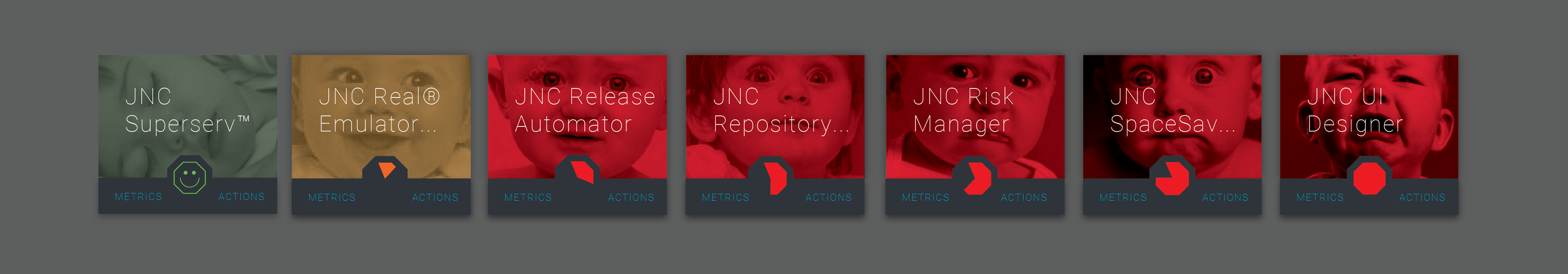
Concept 3: NURTURING A MELTDOWN Our customers monitor these systems constantly. They are their sole focus, and keeping the system(s) they monitor healthy is their number one goal. These systems are like their baby. The imagery is a direct nod to the system as their baby, and brings a personable touch of “delight” to the UI. This also solves for accessibility issues in that the facial expressions provide a recognizable state of distress, whether in color, or gray scale.
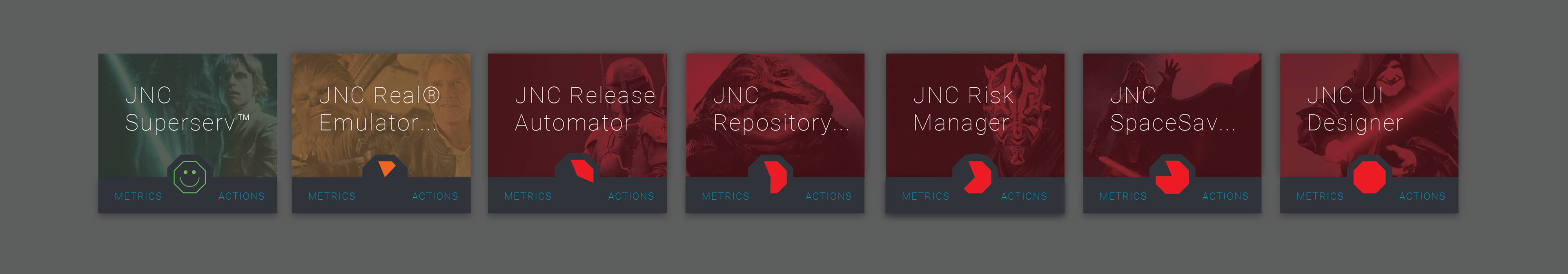
Concept 4: USER SPECIFIED The idea here is that we not only provide default imagery, but the user has control of customizing the UI to suite their personal interests. Whether it be Star Wars, Plants, Animals, etc. there is almost always an extreme condition (villains, predators, storms, etc.) that compliments the ideal scenario (super heros, favorite animal, sunny sky’s, etc.). The problem this poses is that the user might not select an image that works well for accessibility purposes, however, it can be argued that the user with impaired vision might simply use a default theme, rather than a custom theme. This would bring an elevated level of “delight” to the UI and over-all user experience.
COLLAPSED STATES
To accommodate the zoom levels in the Map View, or to provide the user with options of optimizing their workspace on the Home Page, or wherever else the tile’s would be utilized, the amount of information reduces within each instance. The pie chart becomes the focal point, and primary visual representation of the tiles state, as the tile decreases in size.
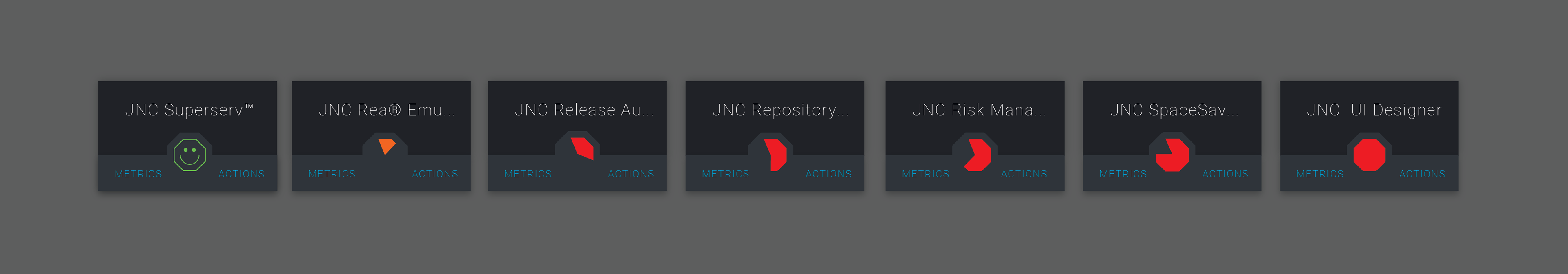
THE BIG REVEAL
Displaying supporting/relevant information within a dropdown menu, makes the tile scalable for future enhancements. Meaning, additional information (variables, actions, data viz) associated with each tile, in future development, will have a place, consistent in context (Info, Actions, Metrics), for future development and/or implementation within other products. On each tile, there are three clickable areas; the Metric button, the Actions button, and the pie chart (Info). The Metric button would provide a place for any metrics associated with that thing. The Actions button would provide a menu of available actions (Report, Open in Notebook, Investigate, etc) available for that component (application, server, etc.). Info would be all the available information about what the pie chart is based on and/or information regarding the component that the tile represents.

Feedback is Appreciated
This was my best foot forward. This company allowed me the time and space to accomplish my goal, almost to it's very end. While I was under-taking this assignment, I was also supporting the Dev Team and Product Team's with quick wins and fire drills. I feel as though this was a good effort, but I'm always looking for ways to improve. My question to you is:
Have you gone through an exercise similar to this and, if so, what did you do different and what was the outcome?
Thank You,
[Jeff Nixon]