Project Description
LikeWize is a mobile application dedicated to connecting like-minded
consumers based on health, and taste, preferences to improve their purchasing decisions. The MVP addressed adult beverages, and related products, based on the social nature of those categories. In-depth market research exposed potential market value along with resources supporting the assumed user needs.
consumers based on health, and taste, preferences to improve their purchasing decisions. The MVP addressed adult beverages, and related products, based on the social nature of those categories. In-depth market research exposed potential market value along with resources supporting the assumed user needs.
Business Plan
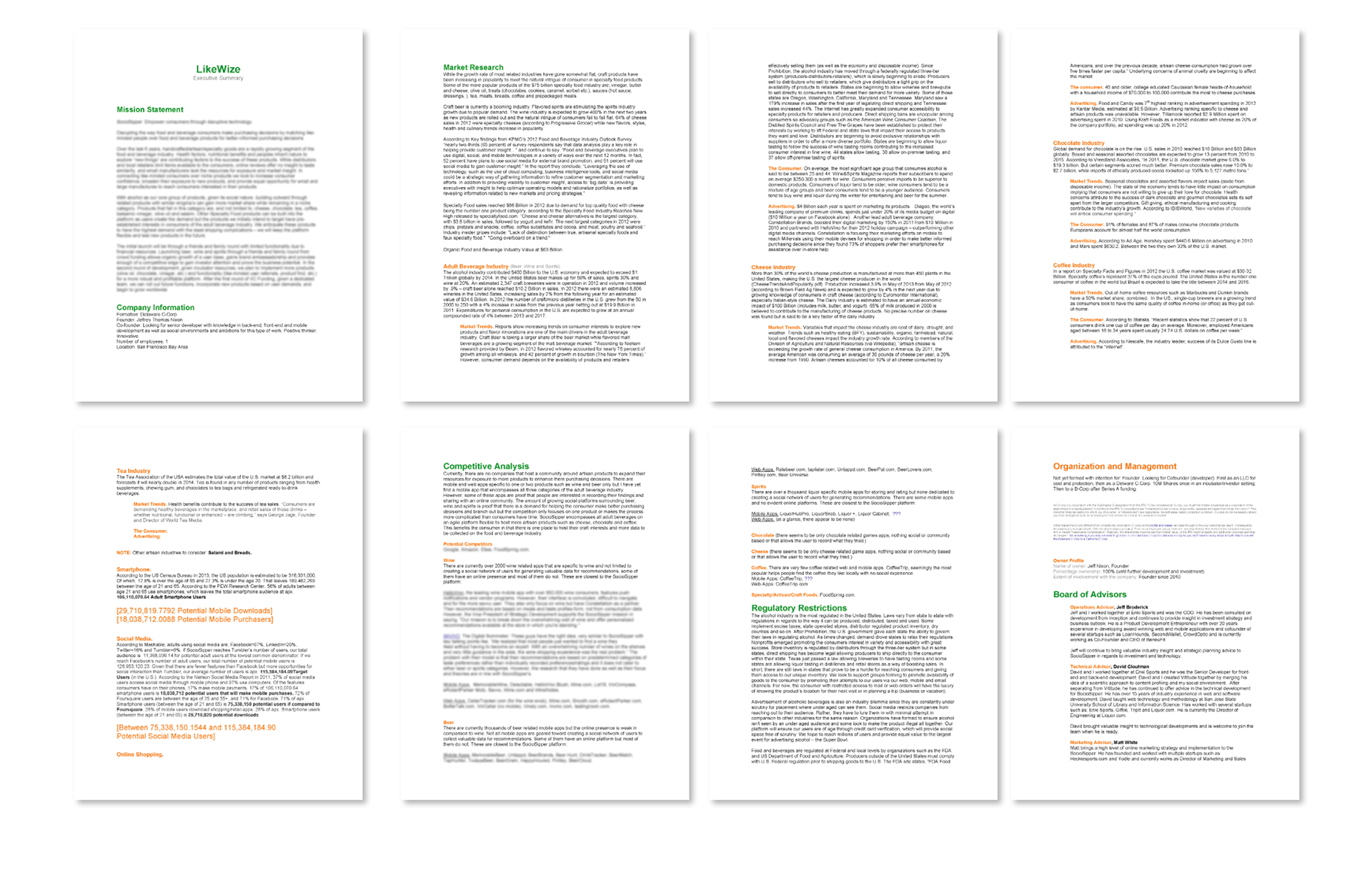
I drafted a business plan, highlighting perceived market value, competitive analysis, cost associated, phased growth, scalability, sale and market strategy, etc. as a reference for the product road map and to track my success through each step. I view the business plan as a living document, and every changing, as the market shifts, resources develop, and new ideas culminate. The strategy is crystal clear and product is well on it’s way.
Wireframes
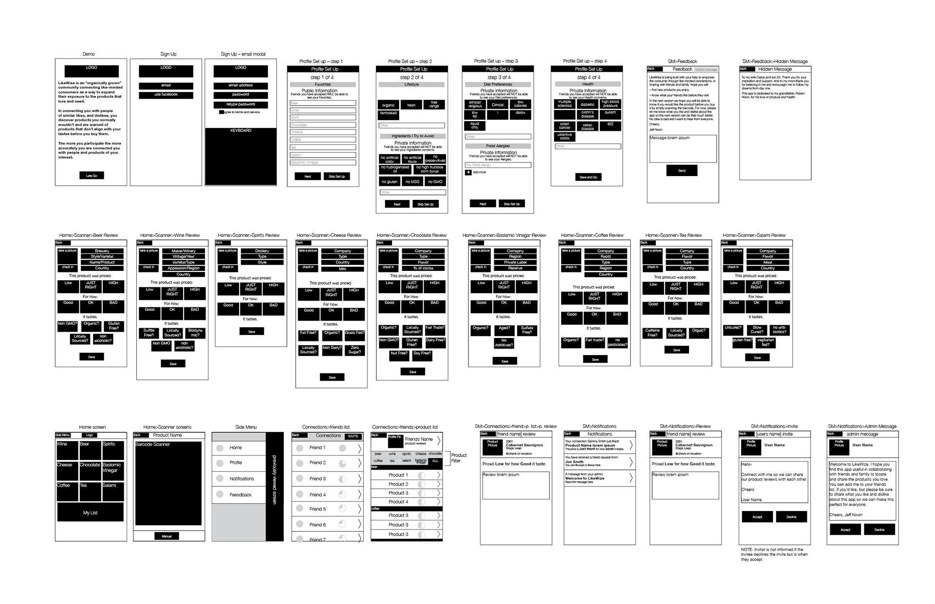
Each screen was rendered in a low fidelity wire frame to work through and caprture features needed prior to fleshing out the UI in high-res. This allowed for a rappid iterative process, quickly defining UI elements needed per screen and thinking through interactions, technical requirements, etc.
Flow Diagram
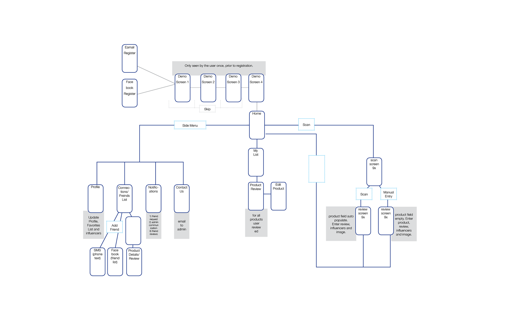
After research on system configurations, API resources, tech specs and user-interviews were conducted, a click-able prototype via Axure was put together and tested to iron out the details. As feedback came in, the product began to take shape and deliverables began to develop. A flow diagram was delivered to the development team to communicate the intended navigation.
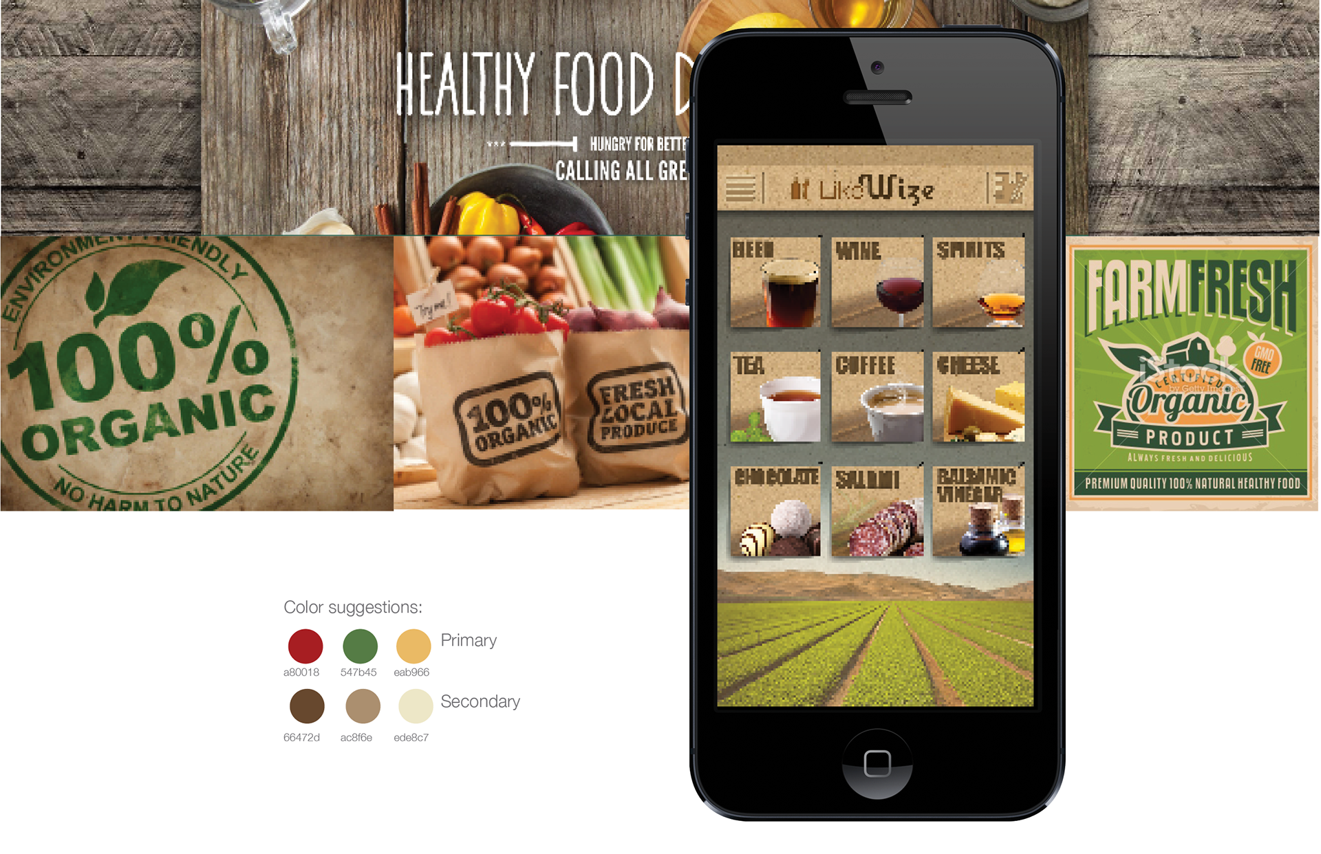
Design Concept
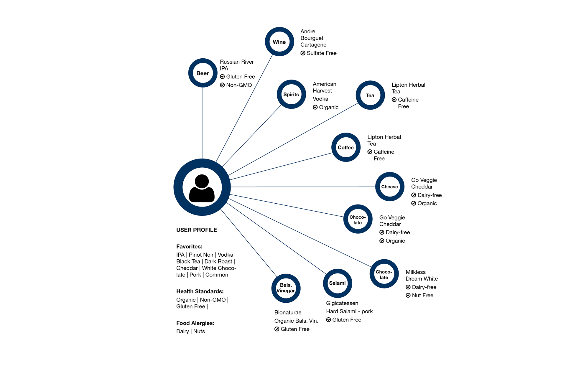
The UI design concept was derived from a demographic study, identifying the target market as Whole Food, Trader Joe’s, BevMo, and Farmer Market shoppers. Not all users fit this demographic but ironically, the edge cases, being beer, wine and spirits consumers not concerned with health and only “new, tasty products”, happen to identify with similar visual aesthetics.
The MVP
Some key challenges in defining the MVP were ease-of-use and accuracy. Being that the Rate screen brings the most value to the product, ease-of-use was a major concern. How do I get the user in, rate a product accurately, yet with the most minimal amount of time in order to collect their data and keep them coming back? Yet, a clear delineation in the rating scale was needed to test the algorithm. A basic button-activated, rating scale, modeled after Pandora, was initiated.
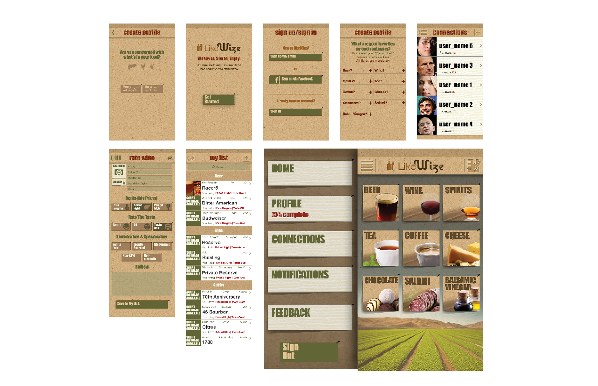
UI Specifications
The MVP targeted iPhone users and was built out to accommodate iPhone 4 and 5 specifications. Each screen’s assets were separated and labeled for xcode and delivered for development alongside a document highlighting UI layout, feature specifications and interactions. Initial development followed a waterfall approach and bug fixes followed aspects closely related to the agile process.
