I met the founders of Sooligan at a pitch-demo event in San Jose, CA in 2013. I was looking for my next project, and what they presented, I thought had plenty of potential. They had just graduated from an incubator with a live working app. The project started off as an immediate need for a clickable prototype that they could demo at a convention in Barcelona, Spain. The turn-around for that demo was 3 weeks, and there needed to be two versions; one in English, the other in Spanish. Once the prototype was created, would immediately begin addressing the next live version of the app. v1.2.
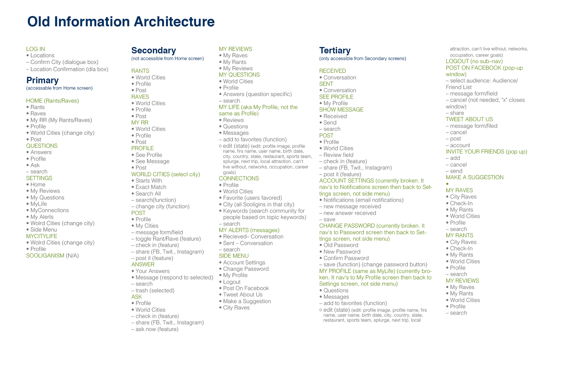
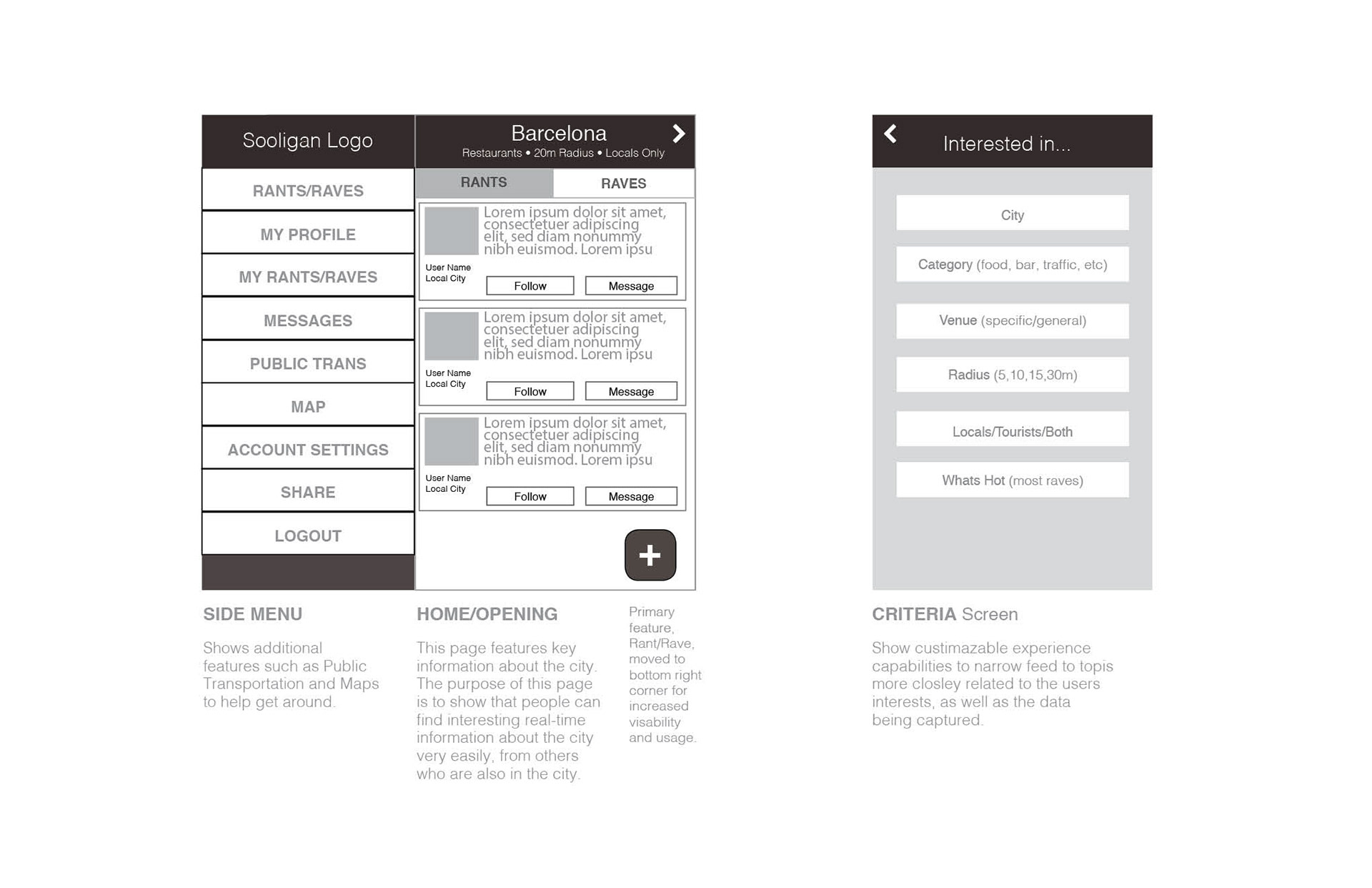
To accommodate the prototype, as well as set the stage for the over-haul, I dug into the existing app and extracted features, content, etc. I loaded the app on my phone, clicked around, took screen shots and recored everything. The image below is a recording of the site map, and screens, of what was currently live.
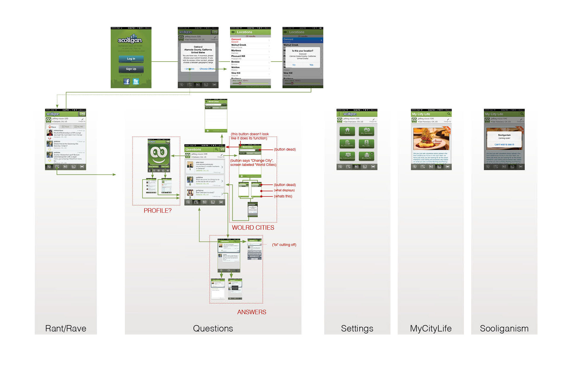

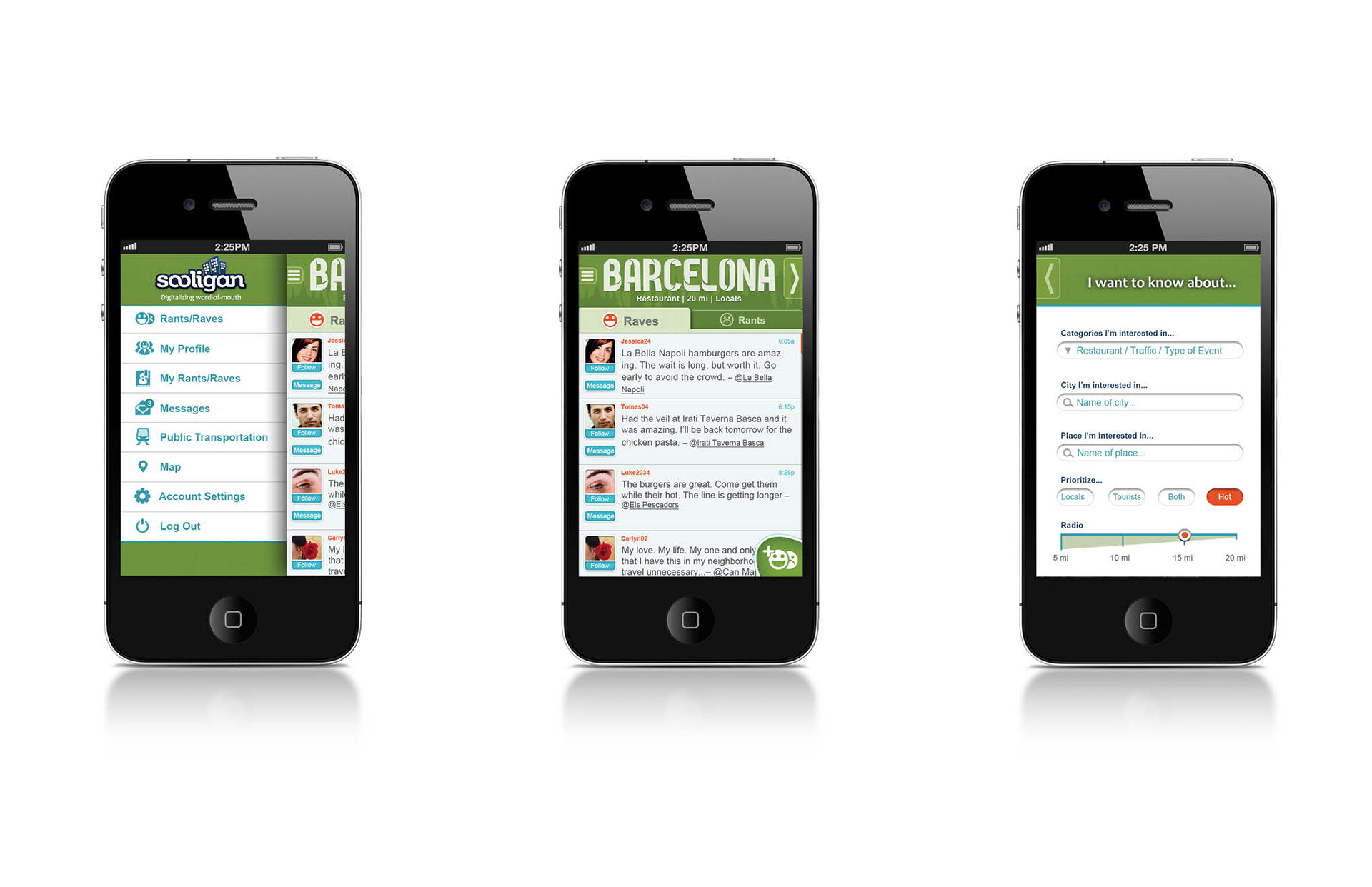
The prototype was executed in POP (Prototype on Paper). The screens below are screen shots of the primary screens delivered for the Barcelona presentation. I chose to keep close to the existing design, in order to buy more time in the research phase, and keep a level of consistency with what was currently live in the app store.
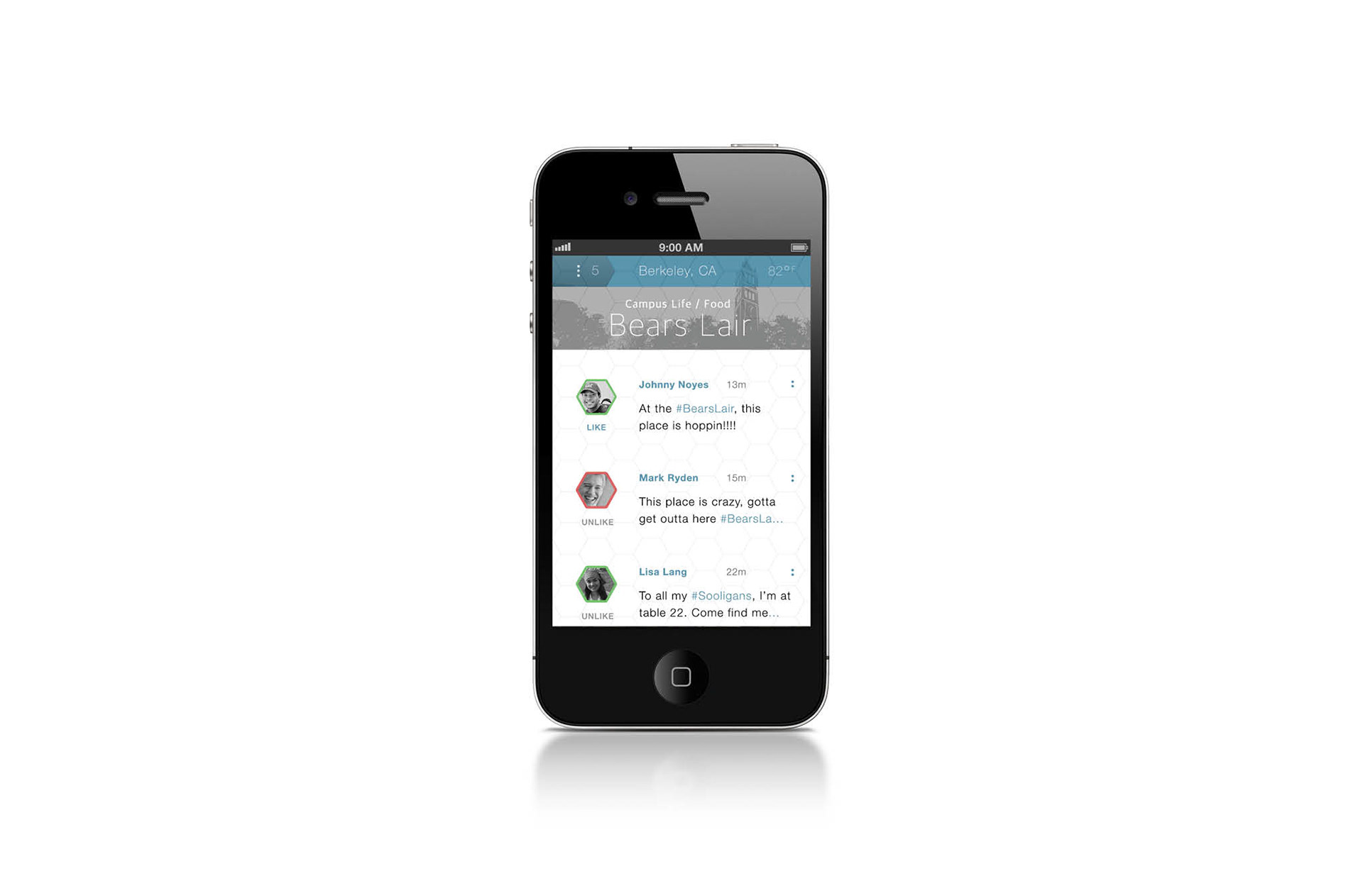
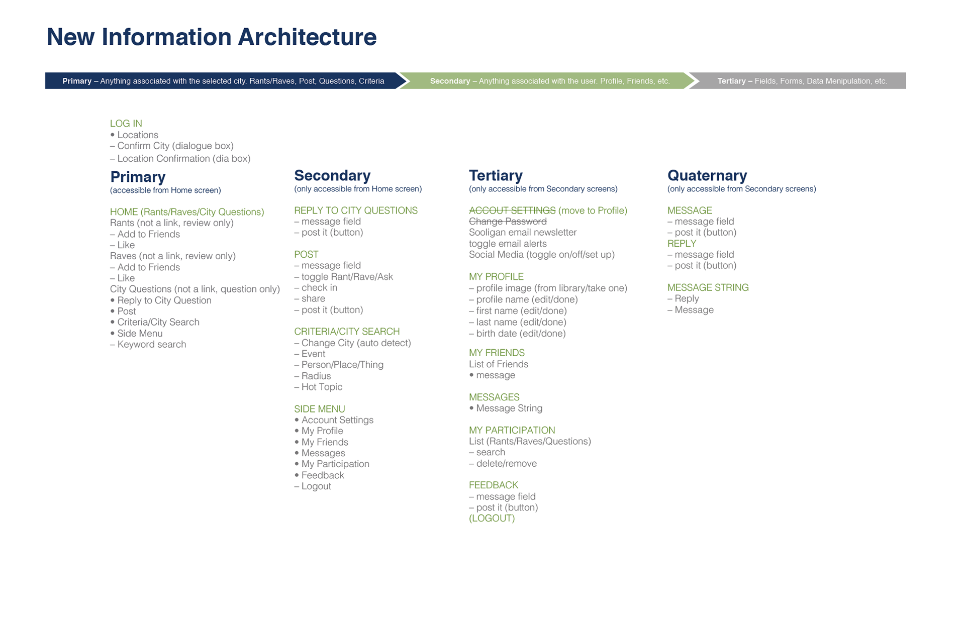
With all the documents leading up to the prototype, I simply added the new features to the existing structure, wireframe, and established a new style. I used the hexagonal patterns as a metaphor for a Strong Network. Given the nature of bee's association as a network, and the strength of a honey comb, I felt this was a good foundation to base the design on. From a design standpoint, the idea was for the hexagonal shapes to serve as a grid for all elements to snap to. As the user scrolls through the feed, the images of other users snap to the grid. Other navigational elements snapped to the grid and inevitably became the over-arching pattern for any and everything UI (transitions, animations, elements, etc.).